At Image Direct, it’s typically best practice to ensure that a website we build and/or develop is working the way it’s designed to.
This may be as simple as running a Google search to ensure that it appears in the intended results, to exploring a live site thoroughly and making sure every page is where it’s meant to be. However, this isn’t always the case: one website I had worked on recently was giving me error messages for the content I’d posted – the dreaded HTTP 404. It turns out that changes implemented in the website’s theme was preventing the pages from appearing, and as such was easily fixed by one of our skilled web developers.
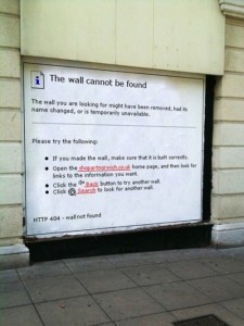
Any given website should, as standard, have a 404 page in place; accidents do happen, after all. Not only is there a minor cottage industry among web developers the world over in creating amusing 404 pages. Even in the physical world, 404 pages have become a way to comment on the pace of modern life:
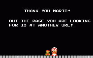
This, and many other clever 404 pages, have been helpfully archived at this Pinterest board. I personally like this Super Mario themed one:
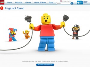
…and this LEGO variant is effective in its cuteness:
Mistakes do happen, and if you can ease the blow with good grace and a pinch of humour, the end user will be willing to overlook the shortcoming. And even though no-one likes seeing an “error 404” page, thankfully there are web developers out there who are willing to turn an apologetic necessity into an artform of its own.
Further reading:
- The Best 404 Error Pages Of All Time [Business Insider]
- 17 brilliant 404 pages [Pingdom]
- 404 Pages, One More Time [Smashing Magazine]
Image Direct builds websites, 404 pages and all. Talk to us today about increasing your web presence.
Do you wanna build a website?


